What is Divi?
Divi is a visual editing tool in WordPress that allows you to build pages without knowing any code!
It allows you to design and edit beautiful pages using a drag-and-drop editor that even your Grandma can use!
With over 40 completely customizable module building blocks, you can design a page like playing with Lego. Since Divi is a visual builder, you can see the page come to life before your eyes.
Not interested in building pages from scratch? Don’t worry! Divi has a few free templates you can choose from that are built right into your website. Even more templates are available from third parties online if you want something more specific.
How to Open the Divi Editor?
There are two ways to navigate to the Divi Page Editor:
- Through the WordPress Pages tab
- Navigate to the page on the front end.
Open Divi Through WordPress Pages Tab
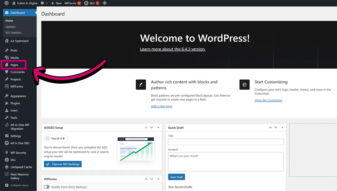
Once logged into WordPress, click the “Pages” tab on the left menu.
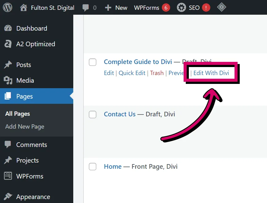
Next, scroll to find the page you’d like to edit, then hover over the name. Click the “Edit with Divi” link that pops up under the page title.
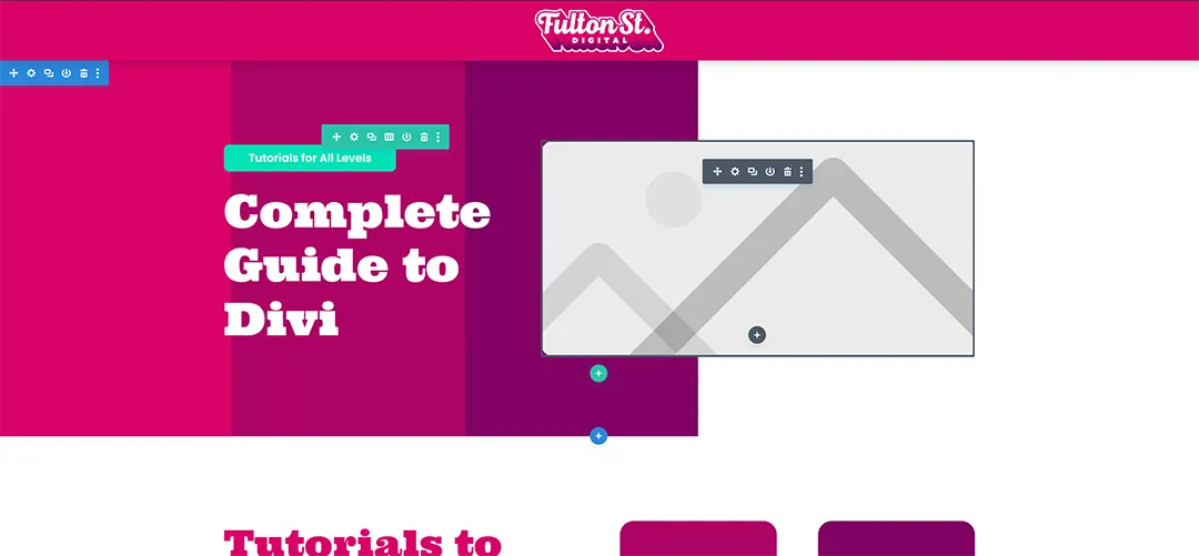
This should take you to the visual builder version of your page. The page should look mostly the same as you’re used to seeing, but colourful boxes outline your content when you hover over it.
Open Divi Through the Front End
You will also need to be logged into WordPress to use this method. Once logged in, simply navigate to the page you’d like to edit the same way you would if you weren’t logged in.
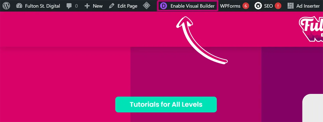
Once you’re on your page, click the “Enable Visual Builder” button on the WordPress toolbar at the top of your page.
This should take you to a replica of your page, but now your content is outlined with colourful boxes.
How to Add a New Divi Page?
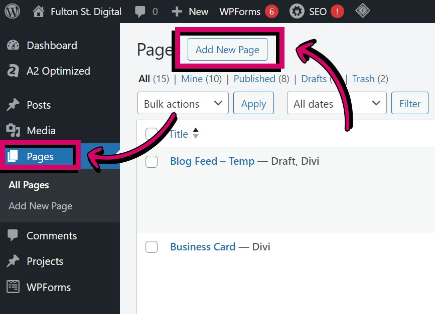
You can add a new page like you’d typically add a page in WordPress. Go to the “Pages” tab in the WordPress backend, then click the “Add New Page” button in the top left corner.
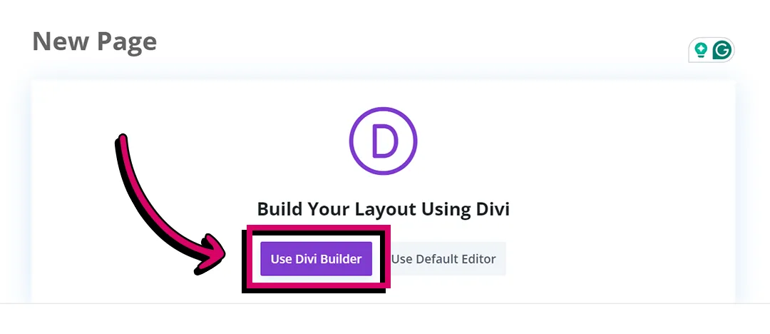
This will take you to WordPress’s default page editor. From here, simply add the title of your page and then press the purple “Use Divi Builder” button.
Once the page is loaded, you will be presented with a pop-up with three options: “Build From Scratch”, “Choose a Premade Layout”, or “Clone an Existing Page”.
Build From Scratch means just what it says; you’ll be provided with a black screen so you can build a new page completely fresh.
Choose a Premade Layout takes you to Divi’s free template library where you can choose from their large selection of templates. Once selected, you should be able to customize it to your liking.
Lastly, Clone an Existing Page copies a page you’ve already created so you can edit it to create an entirely new page.
How to Use the Divi Editor?
Divi is pretty intuitive to use. Once you understand its container hierarchy, it’s easy to create just about anything!
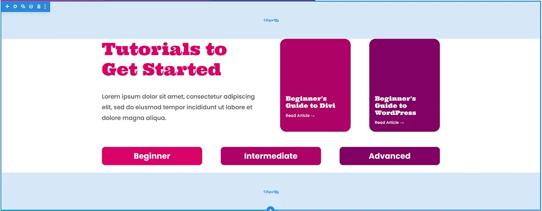
The Divi interface is mainly built using a series of boxes that can only contain a specific type of content. There are sections, rows, columns, and modules.
1. Sections
Sections are the blue or orange top-level container. They are used to hold all of the content of each segment of the site.
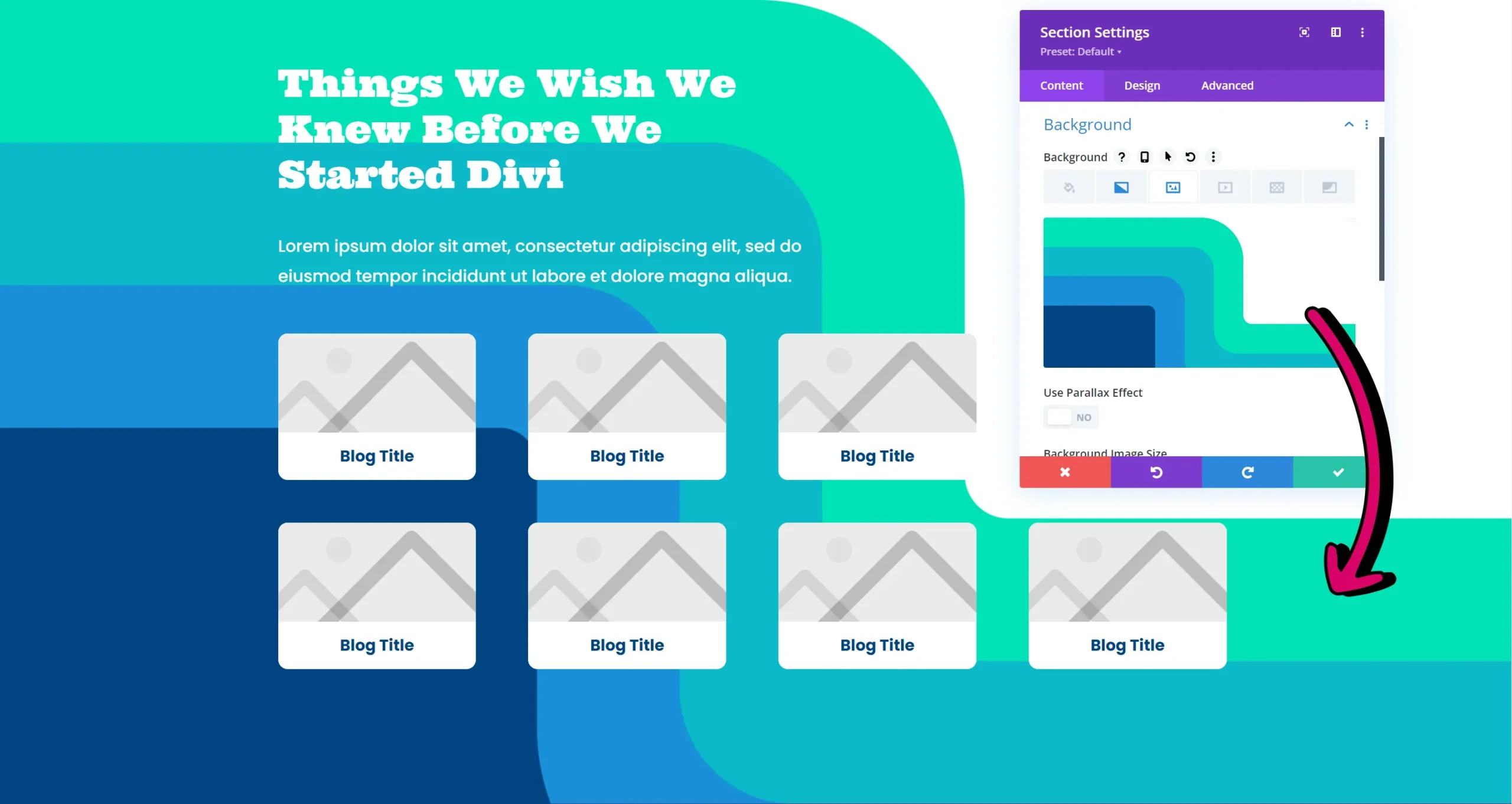
Sections are mainly used to dictate the spacing between segments of your site and to add a background colour/image to that segment.
2. Rows
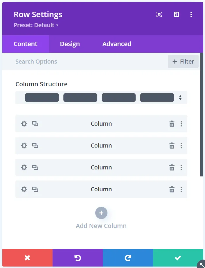
Rows are a special green container that allows you to divide your content into a series of columns. This way you can put different types of content next to each other rather than have everything stacked on top of each other in one big line.
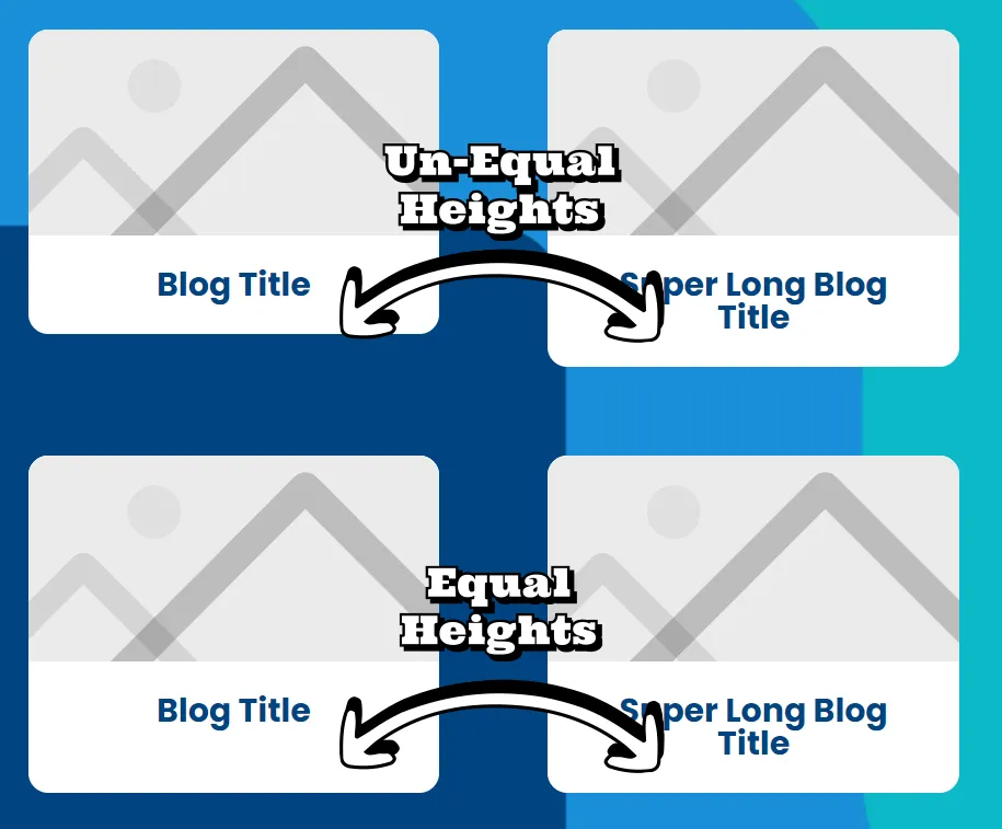
You also control the spacing between columns and whether the columns have equal heights in the row.
3. Columns
Columns are third in the container hierarchy. They aren’t directly accessible by hovering over them like the other containers on this list, so they do not have a colour.
These are probably the least edited containers in Divi since the row dictates much of the columns’ behaviour. However, one helpful use for the columns is adding a background colour to the column so everything in the column is grouped together.
4. Modules
Finally, grey modules of the last level of the container hierarchy. You can add unlimited modules to each of your columns. Modules can be text boxes, images, buttons, forms, or basically any type of content you’d like to put on your page. Each module controls unique features of that type of content. This is where you’d spend the bulk of your time designing.
How to Edit a Module?
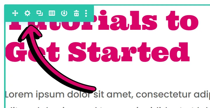
In order to edit sections, rows, or modules, simply hover over the container you’d like to edit until it’s highlighted in its particular colour, and a toolbar appears in the top left corner.
Click on the settings icon.
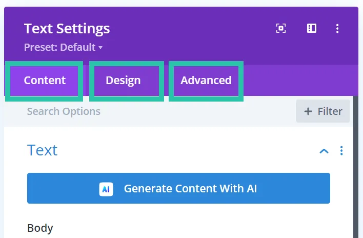
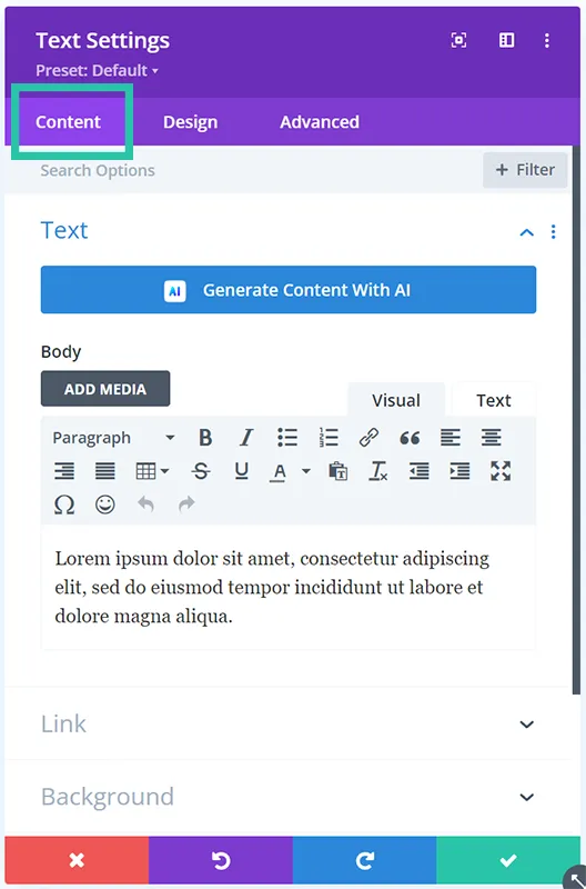
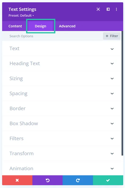
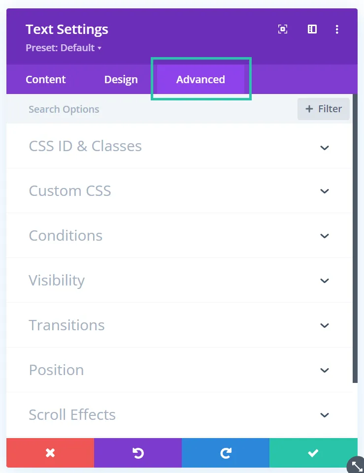
This editor is split into three tabs: content, design, and advanced.
As the name of the content tab suggests, it usually allows you to edit the module’s content. The first part of this tab varies drastically between modules. In the image module, the content tab will enable you to upload and change your images. On the other hand, a text module has a text editor in the content tab so that you can write what you’d like to go in that text box.
Most content tabs allow you to edit the module’s background and add a link.
The design tab is also well-named; it holds all the tools you need to style each module. All modules give you tools to design the module’s spacing, sizing, border, box-shadow, and animations. It also gives you the ability to use transformations and filters on the module.
That being said, the design tab has a slight variance between modules, similar to the content tab. Depending on the type of content the module is built to display, special tools are populated in the design tab to help you style the particular content. So a text module has tools to style headlines and body text, whereas a button module has abilities to help you style the module to look more button-like.
Unlike the first two tabs, the advanced tab stays pretty static across all modules. It holds tools that are helpful to the more experienced users. It allows you to write your own CSS directly in the module or simply add class names or IDs that will work with your external style sheet. It also has tools to edit the z-index, the transition timing, and scroll effects.
The visibility tools are helpful for users with any level of experience. They allow you to hide a module or container based on the user’s screen size. Maybe you want to hide an image on mobile to reduce the amount your users need to scroll. You could check the “Mobile” box in the Visibility section of the Advanced tab, and now the image will be removed.
Once you’ve made the changes you’d like across all the tabs, make sure you press the green checkmark in the bottom right corner of the popup. This makes sure your changes are accepted. Pressing the red “x” in the other corner will discard all the changes you made in that module.
Popular Modules to Get Started With
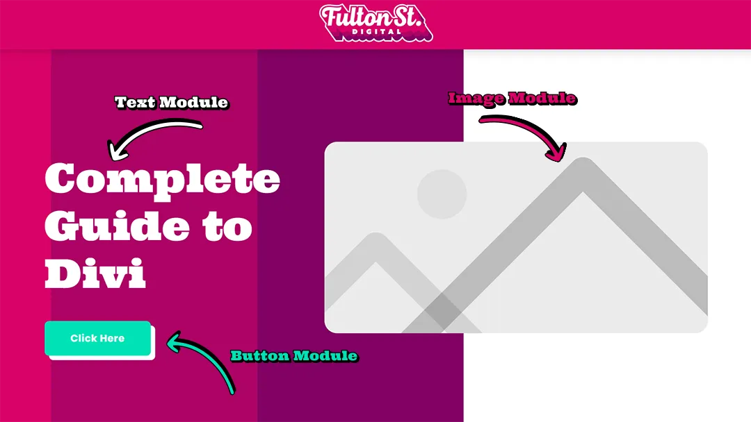
You could build an entire website and only know three modules: text, image, and button. These three modules cover 90% of the content we use on our websites, and we are professionals!
If you want to dig a little deeper, then the blurb and toggle modules can be very helpful.
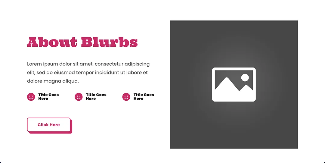
The blurb module groups an image, a headline, and body text into one module, making it easier to edit. This way, you can add a cohesive background to all the elements as a group rather than trying to hack the background across each module individually.
The blurb also has this cool feature where you can substitute the image for an icon and select from Divi’s extensive icon library. Then it’s one less image you need to source.
Whether or not you choose to use an image or an icon, you can choose to put the picture on top of the text or to the left. It’s kind of like a hack that allows you to have more columns and makes for cooler layouts.
The toggle module allows you to create drop-down functionality to contain any content you’d like!
This module is handy when creating FAQs or collapsing long paragraphs of content. The accordion module does something similar but has a few more limitations.
That said, once you understand the general layout of the module tabs we went over in the previous section, it’s easy to use any module in the Divi library!
How to Mobile Optimize a Divi Page?
Over 60% of the traffic on the internet today is viewed on a mobile device. So, even if you designed the world’s most beautiful page for desktop, you’ll need to make sure it looks good on tablet and mobile as well.
In order to view your page on different devices, first click the three purple dots at the bottom of your screen in the Divi editor.
Then click on the device you’d like Divi to resize to.
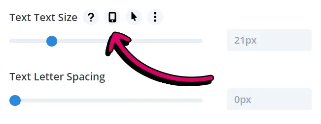
Next, open the popup editor of the module you’d like to edit on that device, hover over the title of the tool you’d like to adjust for that screen size and then click on the phone icon that appears.
Now you should be able to edit using that tool until the module looks better for that device.
I’d recommend you make these changes for mobile and tablet.
How to Save?
As with any project, you should save your Divi design often as you work.
Click the three purple dots at the bottom of your screen in the Divi editor.
Now, a green save button should appear on the bottom right of your screen.
Clicking it will push all the changes you made to your live site. Now, anyone visiting that page will see the changes you made.
Want to test some changes without them going live? Simply clone your page and make the changes on the newly drafted page. You can save your draft page without it going live. Just do not click the publish button, as this will push the duplicated page live.

